welcome to
The tomkat studio blog
Search
A New "Look" for The TomKat Studio
Share To:
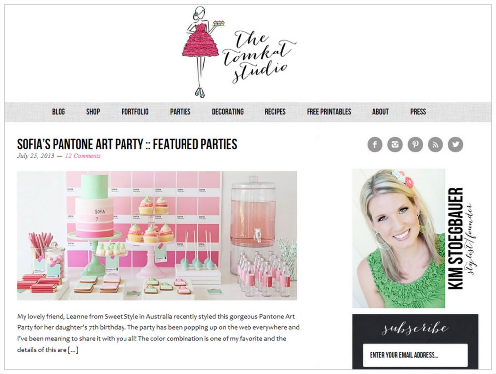
Hello friends! I am so excited to announce the launch of our revamped logo and blog design! I have been working with my girl, Lindsey from Pretty Darn Cute Design to create a more simplified, clean “look” for the blog. It’s been over two years since our last redesign and I’ve been itching to make some changes. First, we started by updating our TomKat girl logo with a new, fancy font. I’ve been loving all of the new calligraphy fonts popping up and wanted to give our logo a more sophisticated look.
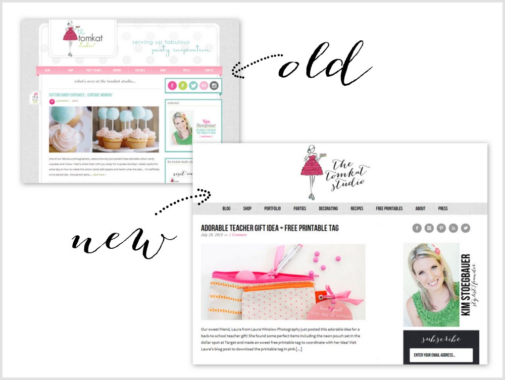
The next step was working on the new blog design. When I worked on our design for the shop early this year, I went really simple. I wanted the photos to pop off the page, so I focused on sticking with a black/white/gray color palette. I decided to do the same with the blog design. I want our gorgeous, colorful photos to be the center of attention! After a couple weeks and several thousand emails between Lindsey and I, we finalized and implemented the design late last week. She was so patient with all of my very particular changes and features! I am so excited about the new “look” and hope you love it too! Good news…the site is now mobile responsive so it is super easy to view and read on your phones and iPads!
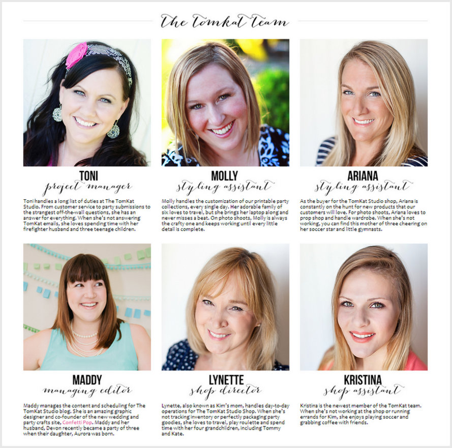
You will also notice some updated features and pages on the blog! I am so excited to finally have an updated ABOUT page, which includes the lovely ladies who make up the TomKat team….
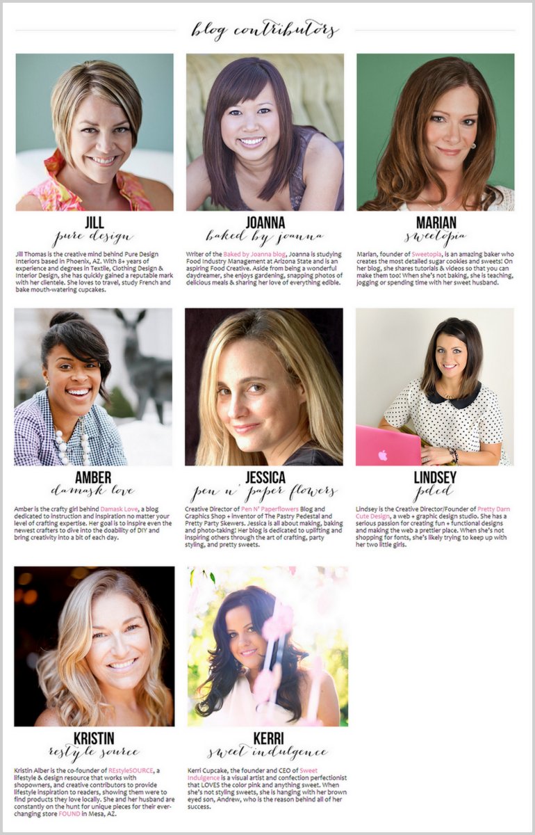
as well as our new team of blog contributors! (more on this incredible group soon!)
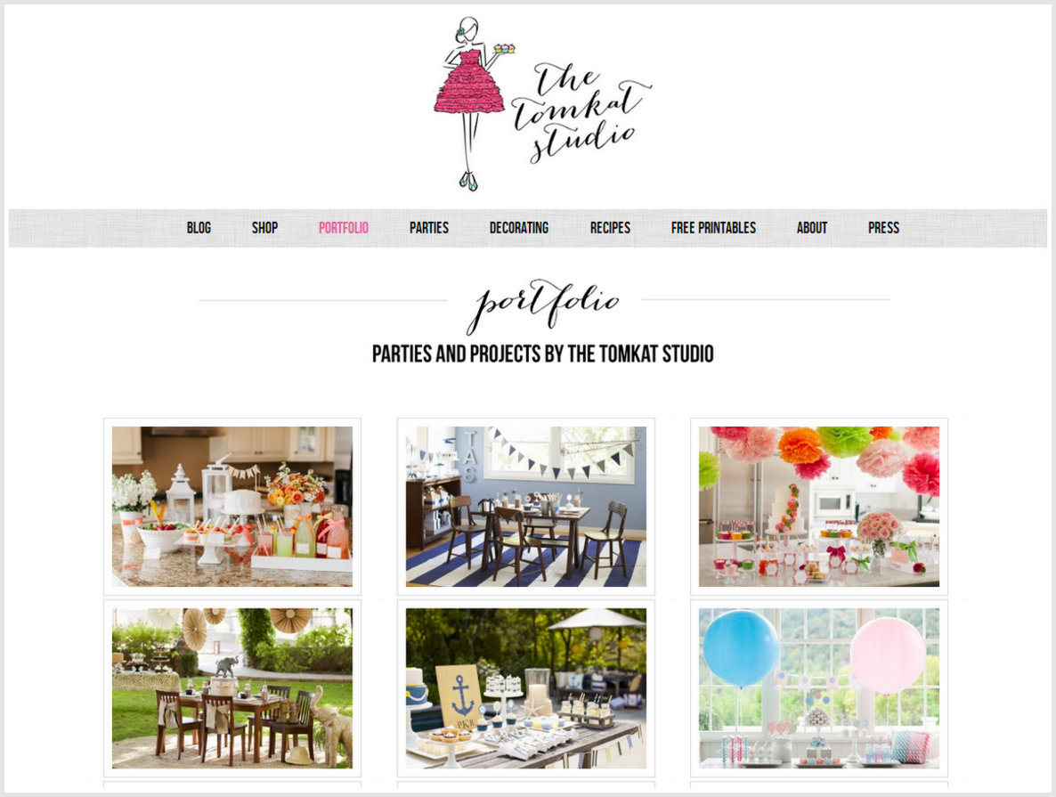
We have also finally created a PORTFOLIO page that will showcase our parties, photo shoots and projects! I’ve added some of our recent projects for Pottery Barn Kids and HGTV, but I will be continuing to add more projects from the past as well as new ones as they are published!
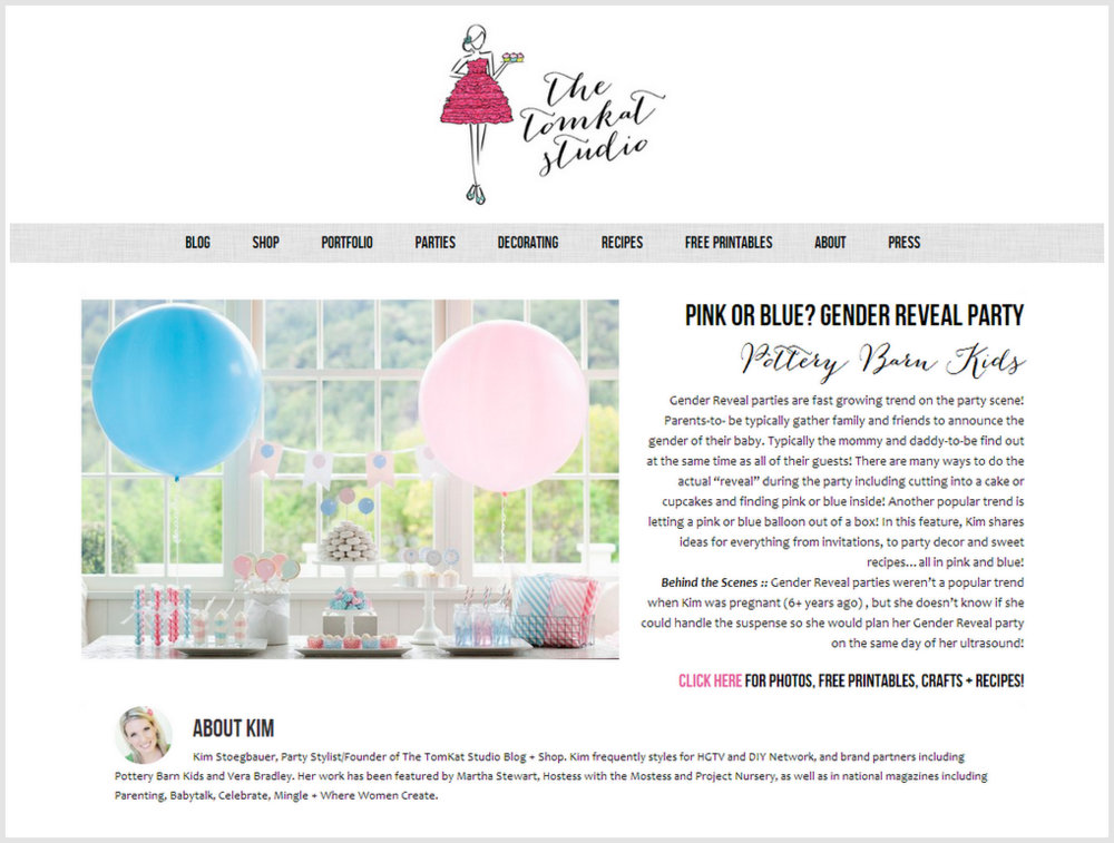
When you select one of the photos from the Portfolio, it leads you to a landing page for that party. The landing page includes information about the party, where to go for more photos, printables and tutorials, and a little fun Behind The Scenes blurb! I’m so excited to have all of our projects in one place, rather than just spread throughout the blog, archived and never to be seen again!
We would LOVE for you to take a look around the site and let us know what you think!
Don’t want to miss any and all things TomKat?
Click here to join our email list!
love, kim
July 31, 2013
Post Date:
Leave a Reply
SUBSCRIBE
Don't miss a thing! Subscribe to our email list to keep up with our latest projects, listings, blog posts and giveaways!
Such a gorgeous new design! Love the new font on the logo and the simplicity of the entire layout. It’s beautiful x
Thank you so much, Kirsten!
love the new look! very simple and elegant.
Thank you for stopping by, Shannon! Just hopped over to your blog and your photography is lovely!
Of course it looks great. Lindsey is the bomb. I used her for my own logo and several other things based on your recommendation — so thank YOU Kim for the great lead!
“Lindsey is the bomb” is a true, true statement! My other saying for her is “Lindsey rocks!” 🙂 So glad you used her for your designs, she is wonderful to work with!
I remember when you updated and it was so pretty, now its gorgeous. I love the design and the new pages.
Thank you, Candi!
I have been poking around your site ever since the redesign was done and I must say I just LOVE it. So clean, fresh, organized and very intuitive. If I ever need a web site done, I obviously know where to go. Great job Kim and Lindsey!!!!!!
Thank you, my dear friend! I’m glad you like it. As TomKat’s #1 fan, we want to keep you happy!
Love it all, especially the portfolio page! So important to keep your projects in one place to show off all the wonderful things you’ve done. 🙂
Thank you, Joanna! Welcome to the team! We are so happy to have you. Our readers are going to love your recipes!
The new site is stunning Kim! I love the simplicity and that calligraphy font is everything! Congrats!
Thank you, sweet Katie! xoxo
loving the new site. the new logo is so fun and classy! Always a class act from TKS!
Thank you, Andrea and thank you for ALWAYS being a big support and taking the time to comment! It means so much to me!
You’ve inspired me to stop procrastinating and re-do my site too. I wonder if Lindsey will work for marshmallows LOL
Love the little dress 3D look on your logo and the bios of your team and contributors. Great job!
Hello to the Marshmallow Queen! Great to hear from you! Thank you so much for the sweet compliments! It feels great to have it done finally! Lindsey is amazing to work with if you are ready to redesign! Hope the book is going great! xoxo
Thanks Kim. Will reach out to her soon. The book is going great 🙂 Tomorrow is the “official” release date!! Let me know when you have an opening in your schedule to do a review/giveaway 😉 I think your kiddos would love to play with marshmallows!!
Lindsey did a gorgeous job – I love it!
I agree, Susan!
Love the cleaner look Kim along with the new font! Inspired for sure…..
Eboness @ Fleur de Lis Events
Thank you so much, Eboness!
absolutely love the new look! i follow your blog quite often and it’s always been so helpful and inspirational, so pretty to look at. great job by all making it even better 🙂
Thank you so much, Jen!
Love your website and blog, looks stunning and a little easier to navigate, I can look at things easily on my smart phone. GREAT JOB! Enjoy the rest of the summer.
Thank you, Cassandra! I’m so glad it’s mobile friendly now, too!
Love it! Beautiful job, as always.
Thank you, Christine!
Well, I’m obviously in the minority, but can I just say that I don’t care for your new design? I think you went too far and made it TOO plain and simple. It looks a little sterile and has lost some of your creativity. I’ve been following you through several re-designs, and I’ve always liked the updates, but I don’t care for this one. Sorry.
Everyone is entitled to their own opinion and I guess the most important opinion for my blog is my own, and I’m thrilled about it! Do you have a blog? I would love to see it and see what you think is great blog design.
I don’t have a blog – I don’t think I could keep up with it and make it a quality project. So instead I read others and get inspiration and ideas from them. I must say I do appreciate how clean you keep your “side-lines” – some blogs have so much along the sides of the “pages” that it’s hard to concentrate on the content of the blog entries . . . and that’s the most important, right! 🙂
Love the new design! I think I was the first one to notice as I am on it almost every day!
Thank you so much, Emily! For the sweet words and for visiting the blog every day! xoxo
I love the new and clean look….it really makes the pictures and colors pop! 🙂 I’m also loving the font!
Thank you, Caitlin!