welcome to
The tomkat studio blog
Search
Gemini Reveal | TomKat Remodel + Staging Project
Share To:
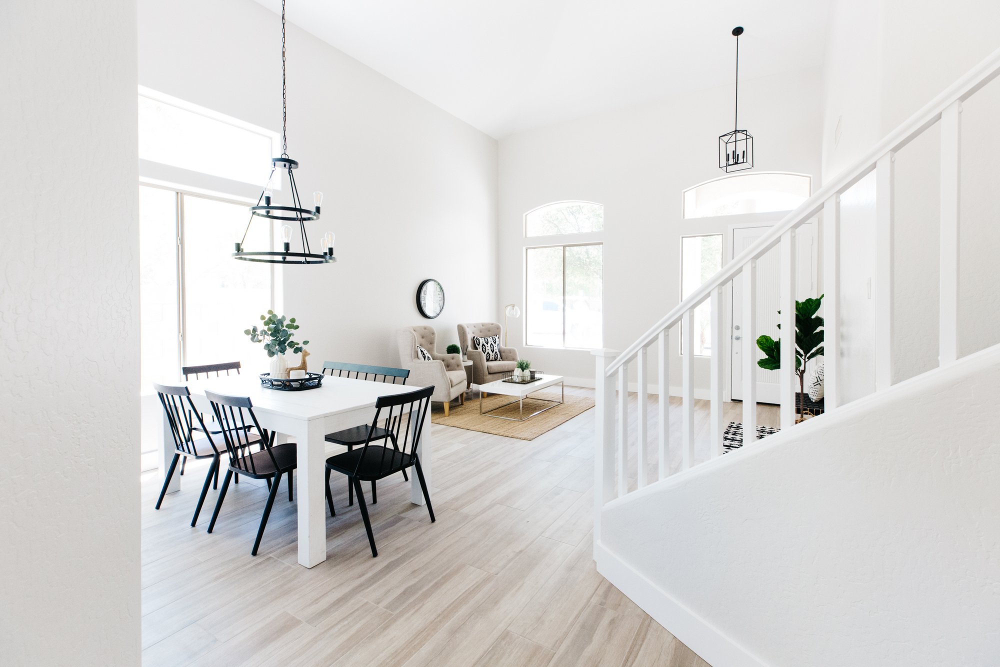
Blogging. Blogging. I’m actually blogging. It’s been awhile, but I know I need to keep up with it! So today, we are showing you the full home tour of the first property under my new venture! (read more here if you missed the news) With the market so hot the past few months, it has been hard to identify properties that are a good price and need my help! When this one came up, I knew it was going to be a good one. It is in a beautiful gated neighborhood that we have lived in (twice), and is a very similar to a floorplan we had. The high ceilings make it feel so open and spacious. Add in a 3 car garage and nice yard with a pool, and it’s a winner. It was a rental that definitely needed an update, so we did just that!
Let’s start with the exterior…
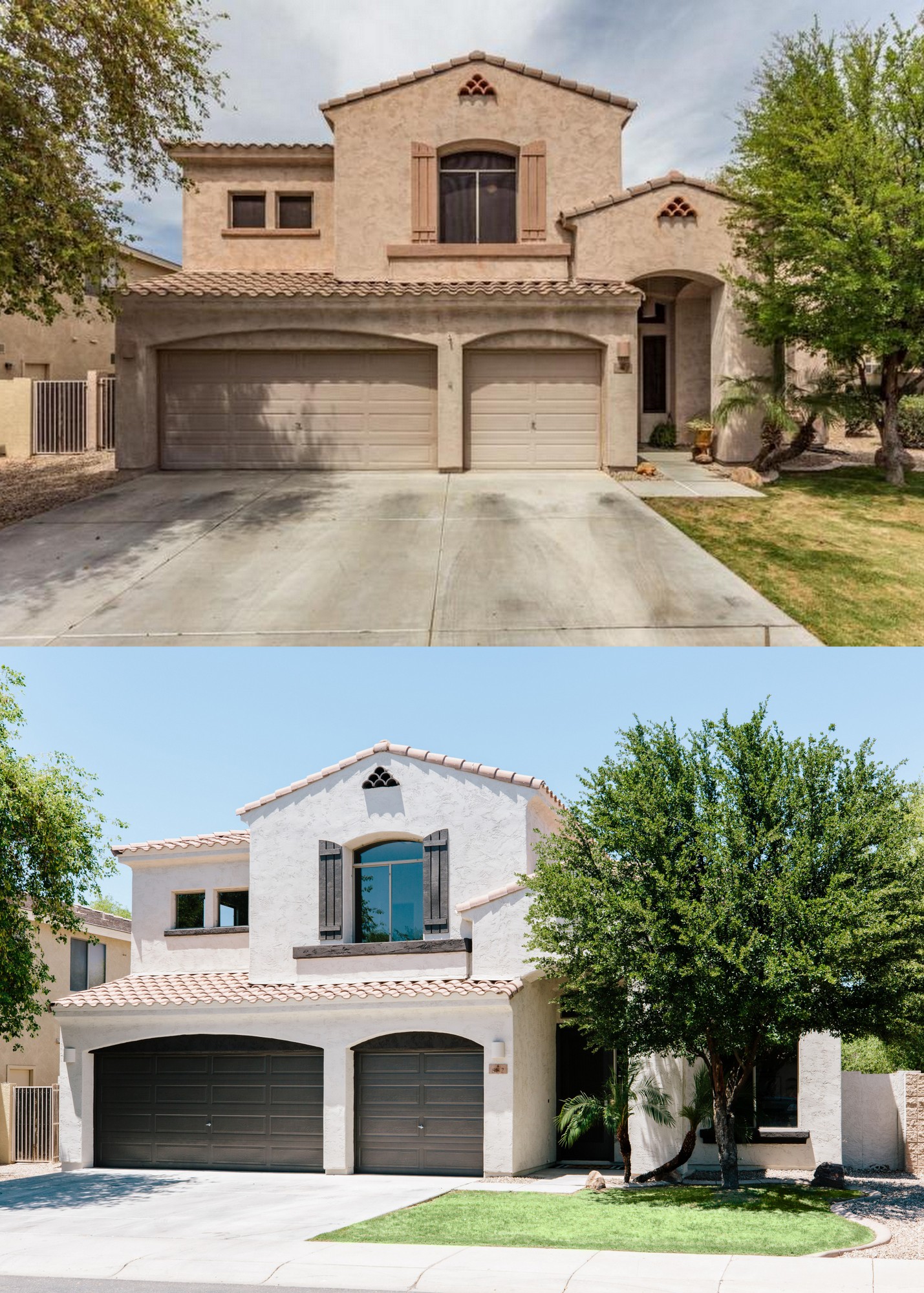
What a difference paint can make, right? I’m all about contrast too, so I love how the dark brown pops against the lighter gray body color.
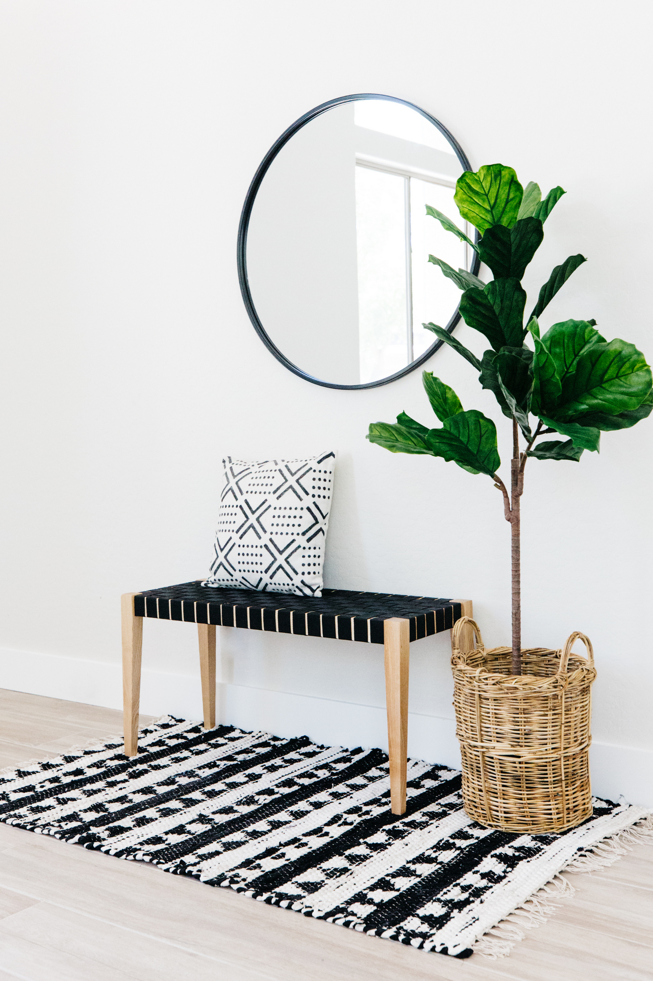
A cute bench, faux plant, black + white rug and pillow create a darling landing space when you walk in the front door. Fresh paint and wood-look flooring updated this house beautifully.
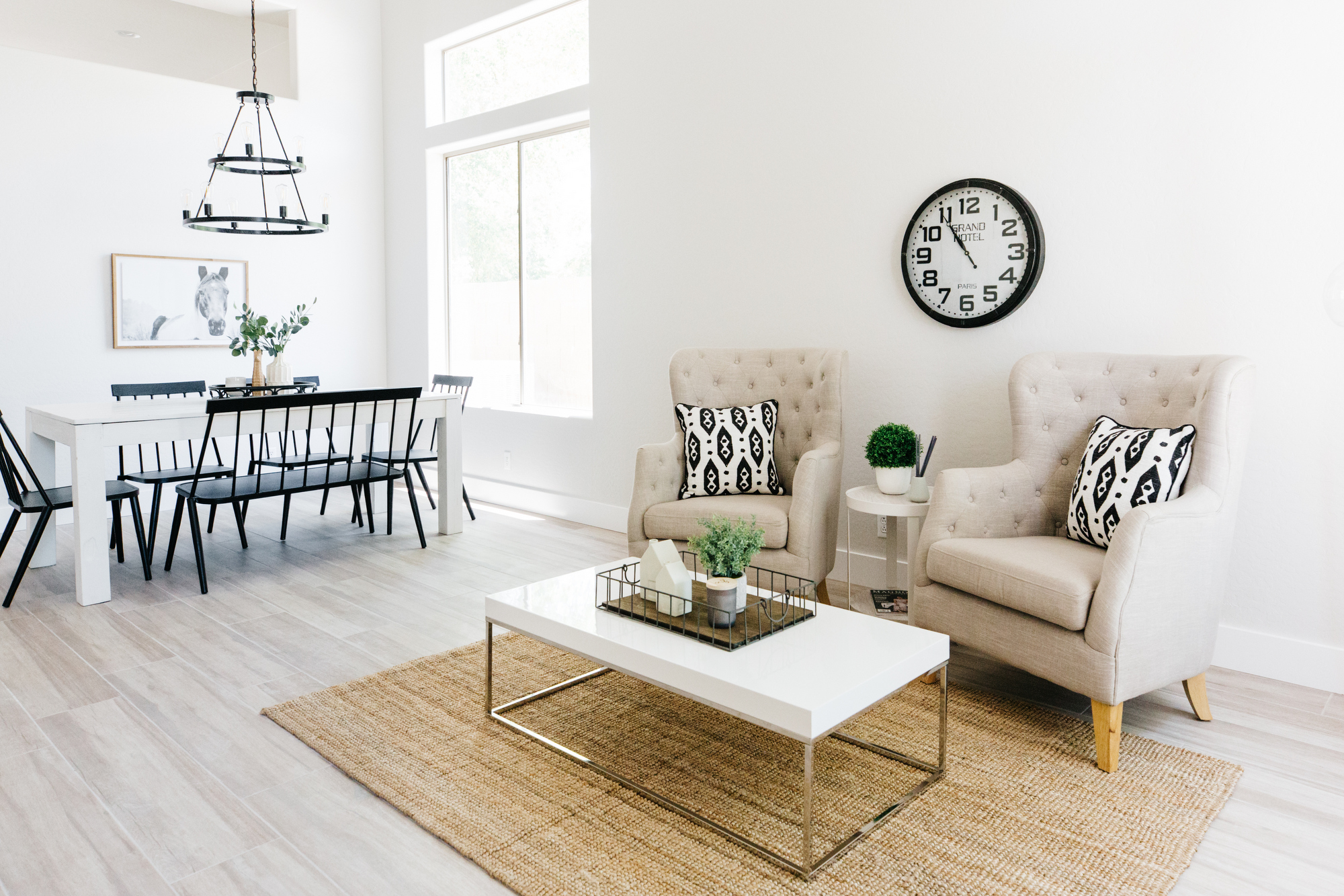
One of the things I love about this house is the soaring ceilings. They are really high in the formal living and dining room which makes the floorplan feel so spacious and open.
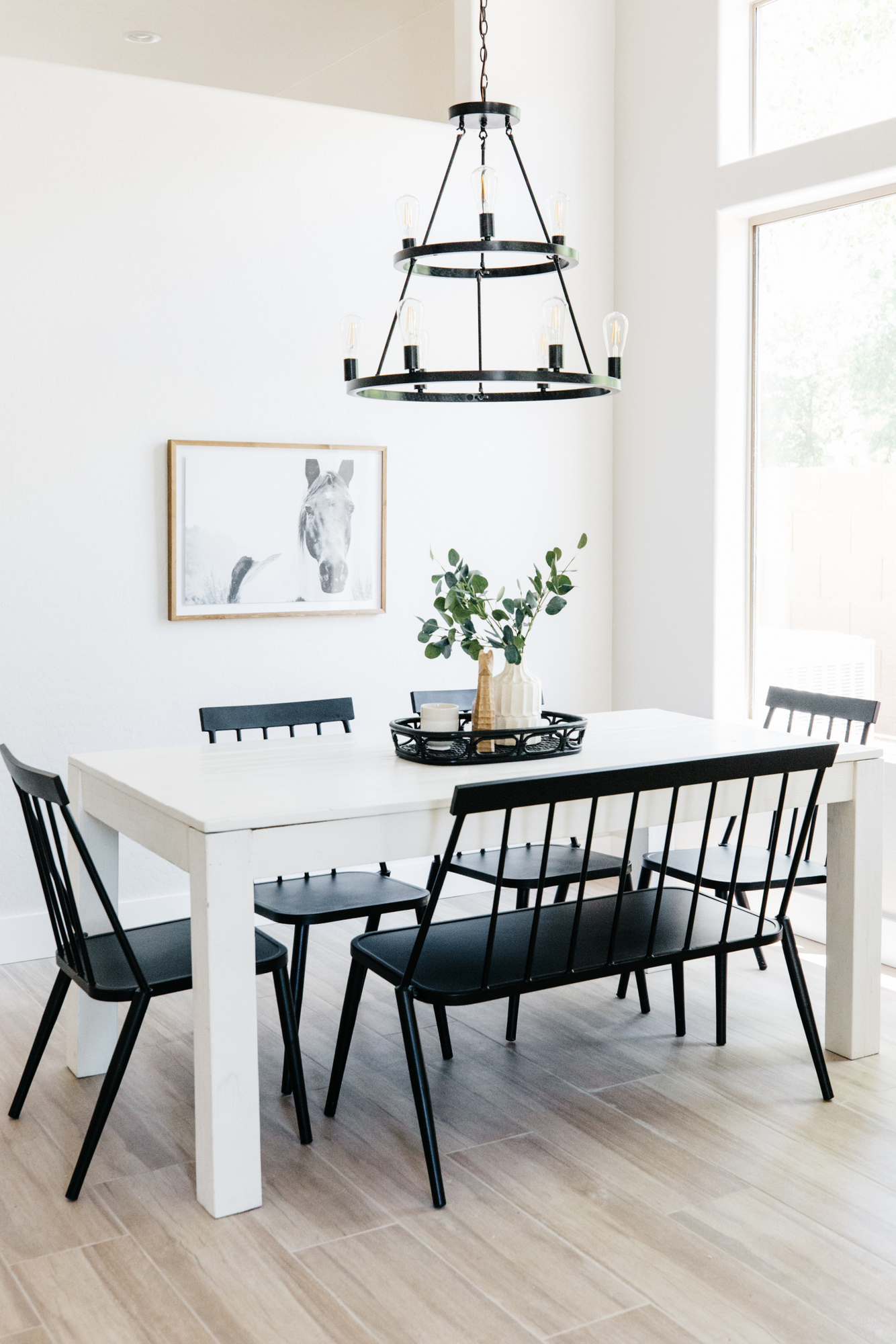
We found this table at one of our favorite furniture store outlets and paired it with these fun black windsor chairs and bench. I love this black iron double-tier light fixture I found online.
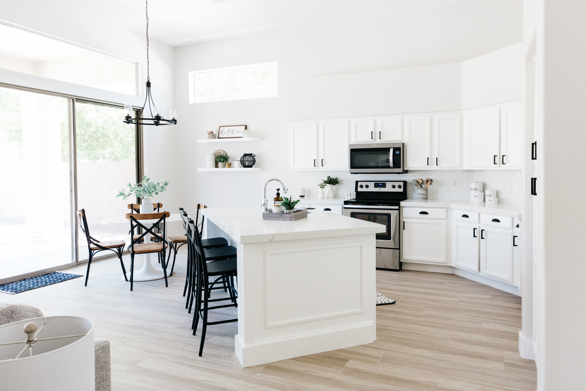
The kitchen! It’s white now! An island remodel, new appliances, quartz countertops, fun backsplash, single bowl sink, chrome faucet, fresh white cabinet paint and matte black hardware and this kitchen is as good as new! We added 2 open shelves for styling and extra storage to the eat-in area. Ready to see the before?
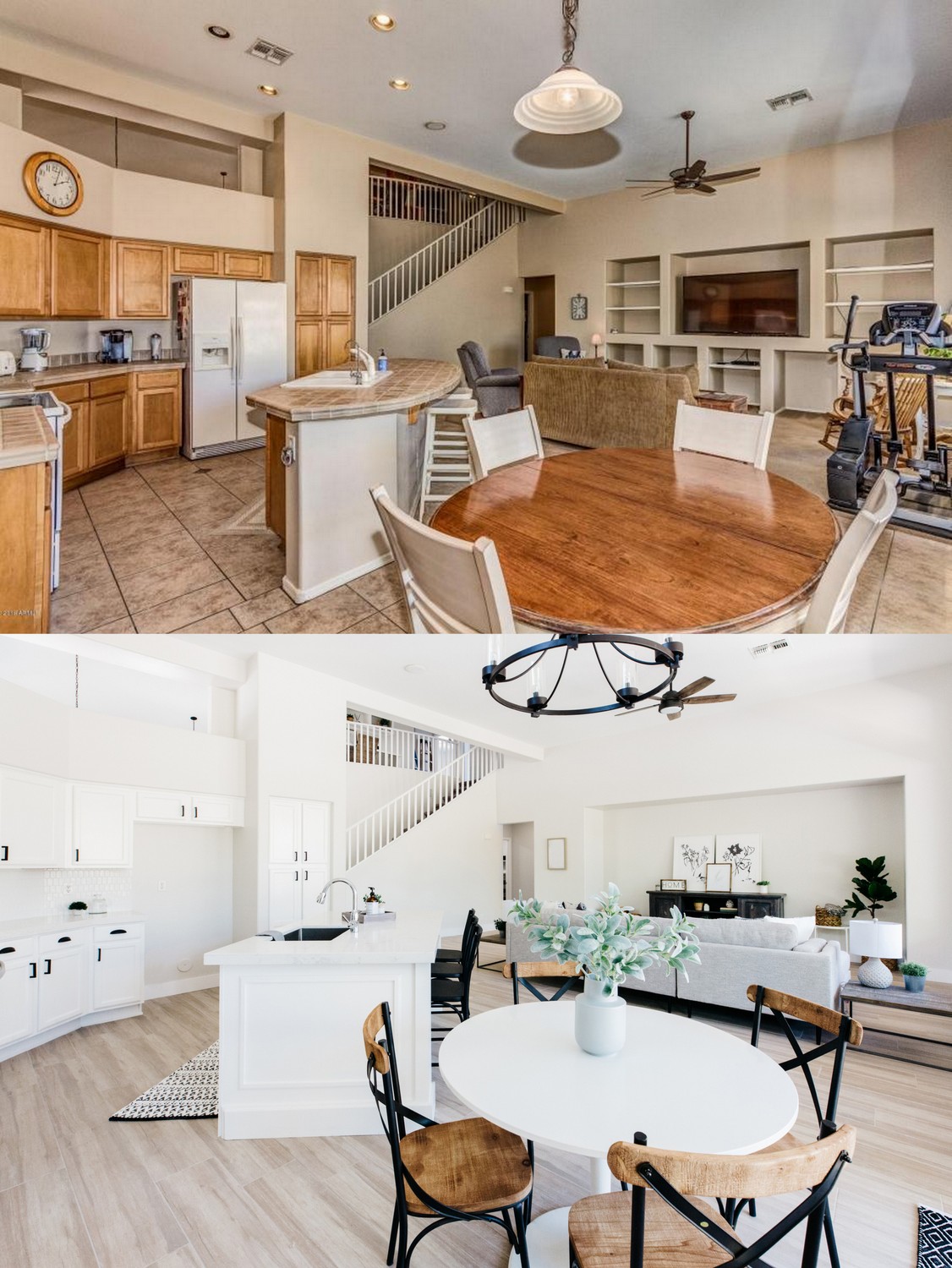
Gotta love good before and after images, right? You’ll also notice we took out all of the entertainment niches to create one large open space for the tv and furniture! SO much better.
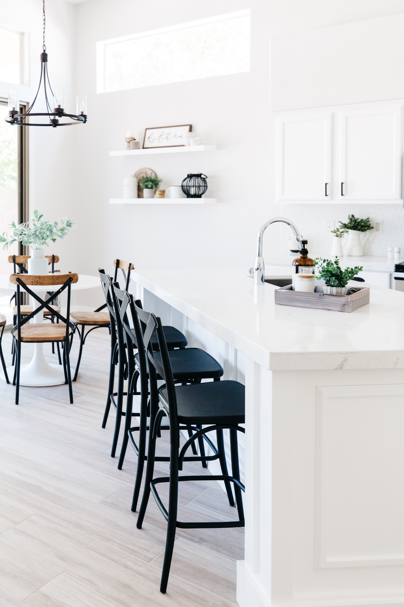
The new island allows enough room for three counter stools to be tucked right in. Find the black bistro stools here.
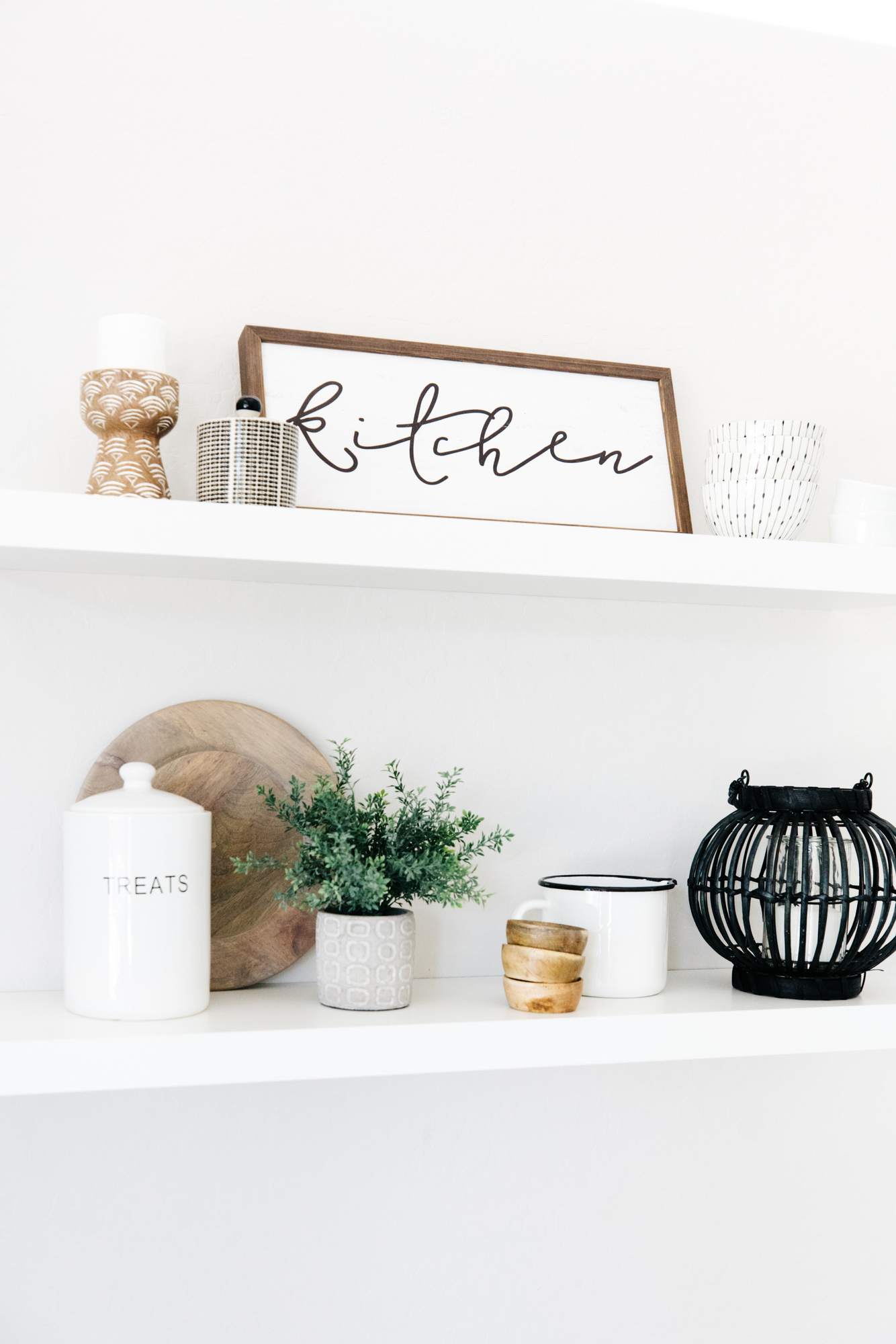
Open shelves are so fun to style (more tips here) so we added them by the kitchen table and styled out with fun accessories.
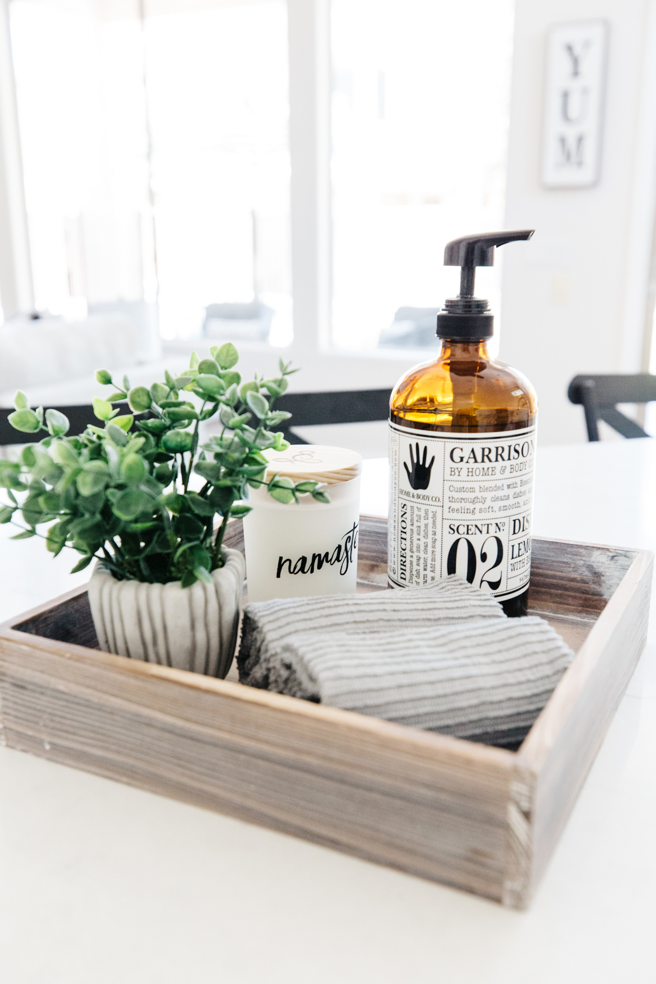
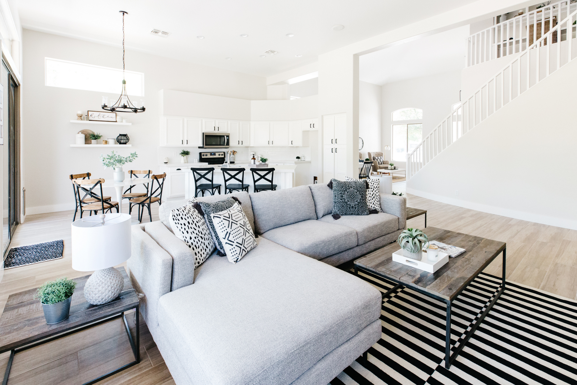
The high ceilings in the family room and kitchen make this floorplan feel open and so much larger than it is. We staged the space with this gorgeous light grey sectional from Living Spaces.
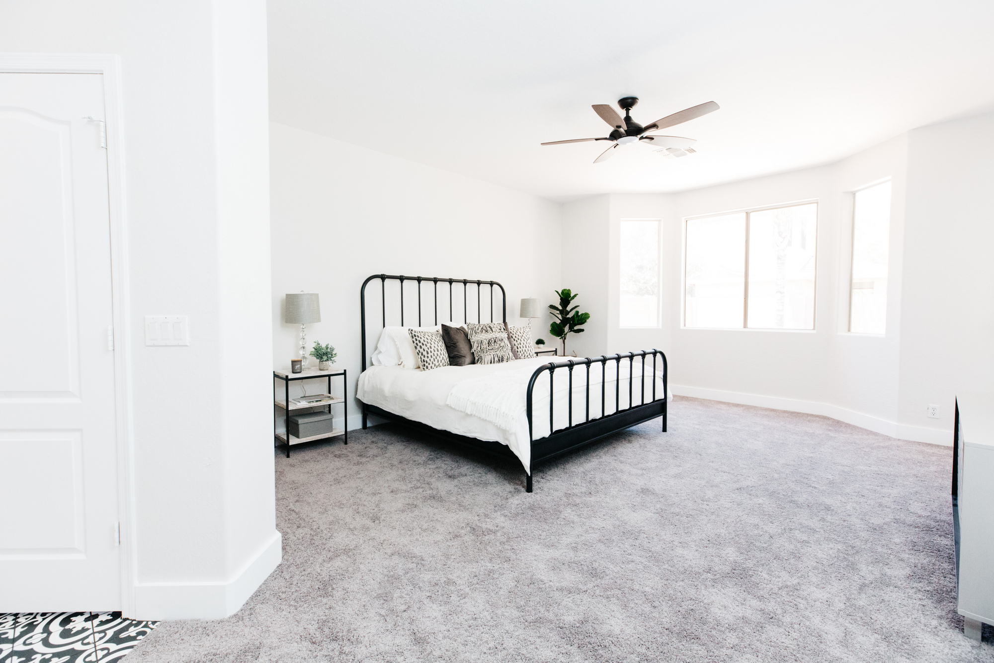
The master bedroom is light and bright with fresh paint, carpet, baseboards and ceiling fan.
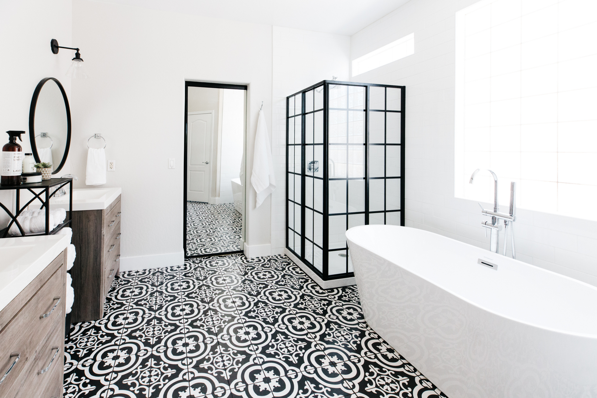
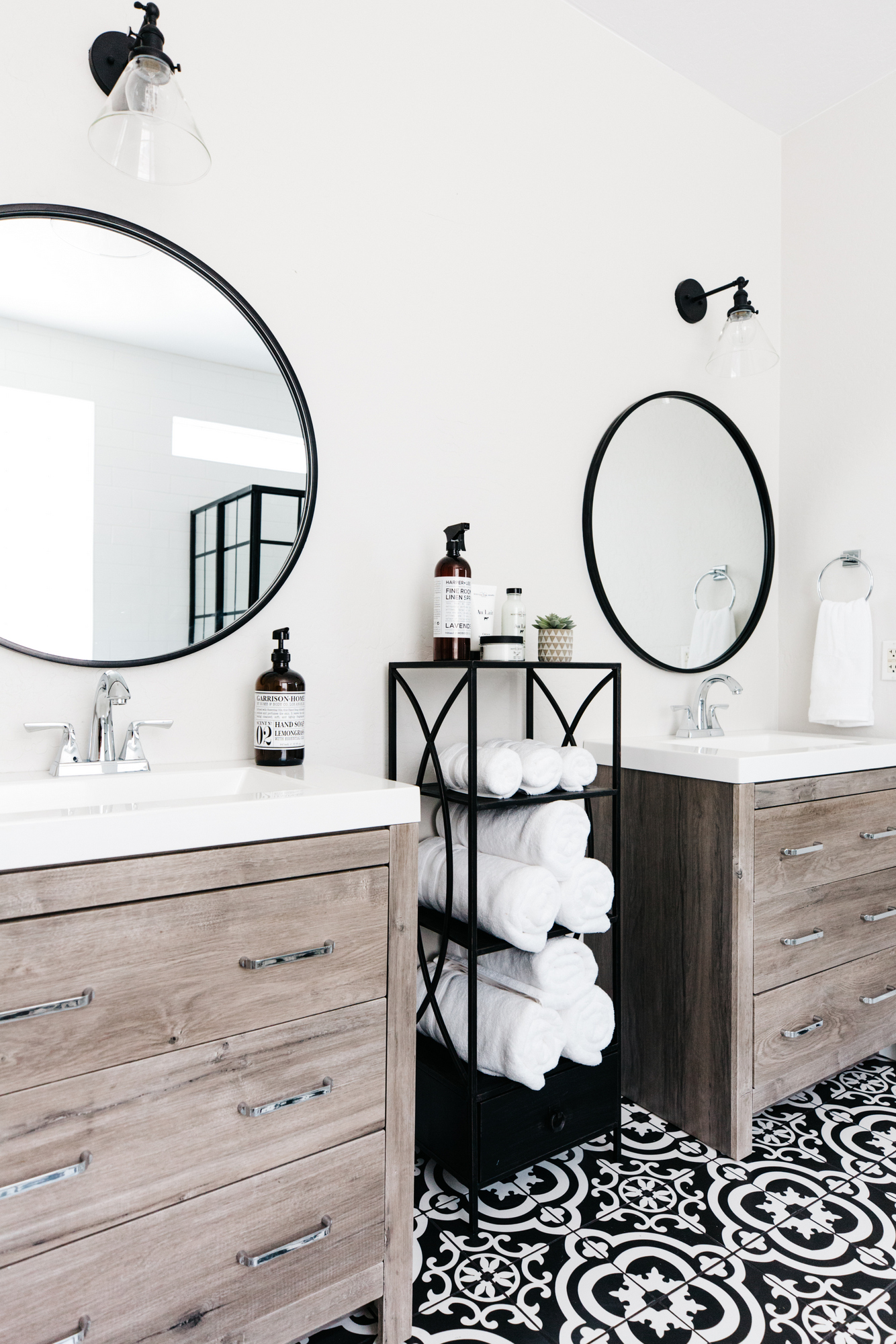
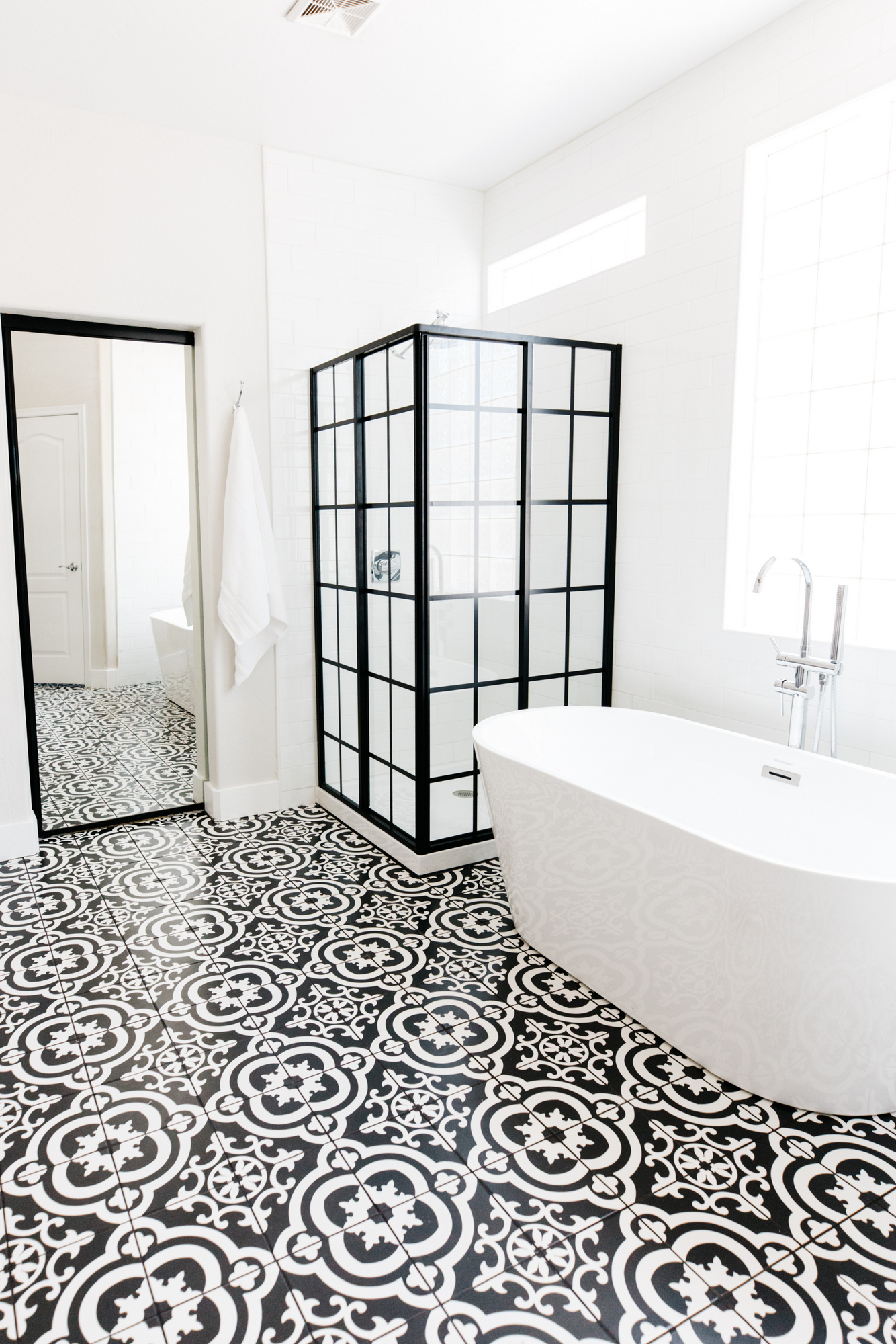
This master bathroom was quite the project! We didn’t have it in our budget to replace the shower and tub, but I failed to communicate that to my demo guy and out it came. You should have seen my face when I walked in and saw they were gone. Whoops! (but secretly I was so happy to get to re-do it!) It’s okay though, because it turned out absolutely amazing!
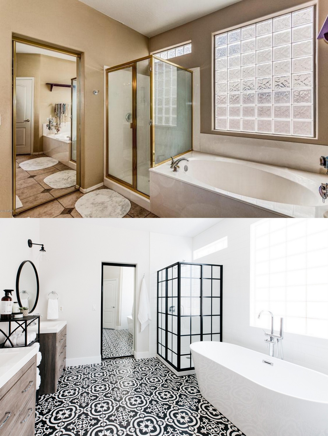
So pretty, right?!
This upstairs desk area went from drab to fab, once we painted and styled the built-ins.
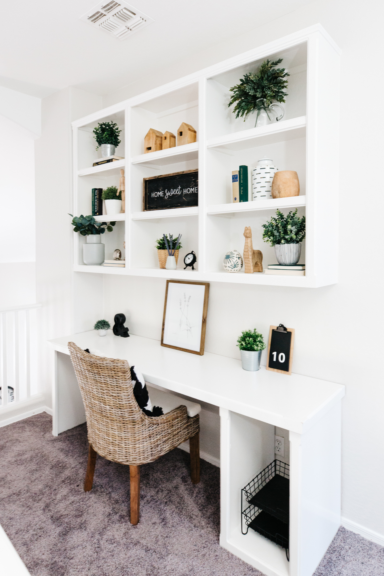
The additional three bedrooms are upstairs and updated with fresh paint, carpet, hardware and fans. We didn’t stage them, so no photos, but the upstairs bathroom got a makeover.

Simple, clean and fresh!
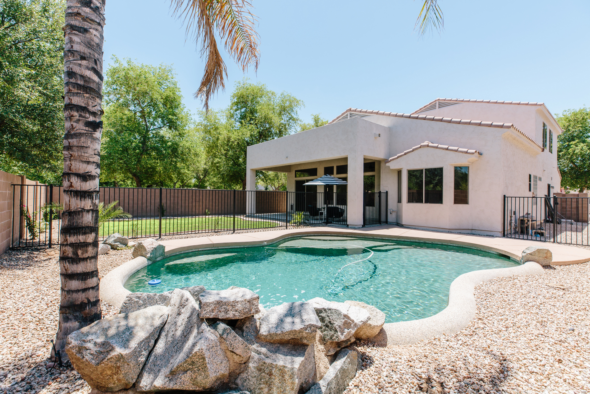
A sparkling pool in Arizona is a must! Such a great home and neighborhood in Chandler!
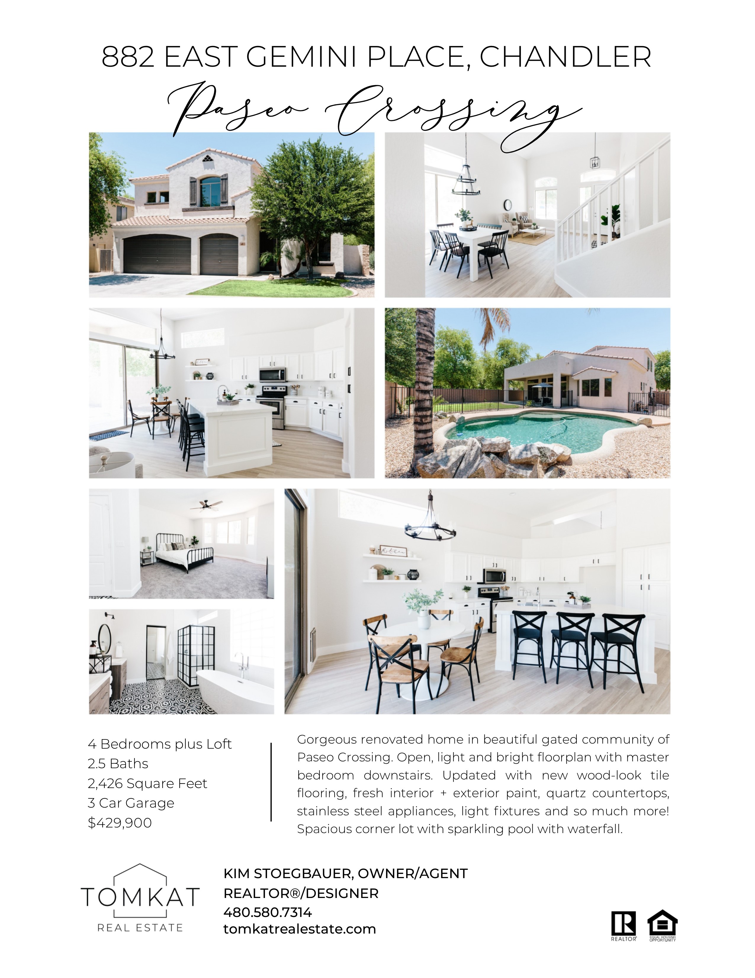
Paseo Crossing: 4 bedrooms, 2.5 baths, 2426sf, 3 car garage, pool. List Price: $429,900
I am happy to report that it closed on Monday! I hope the new owners love what we did to this amazing house!
———————————————————————————————–
If you are in the Phoenix area, and need help with decorating, staging or real estate, we would love to hear from you!

August 8, 2018
Post Date:
Leave a Reply
SUBSCRIBE
Don't miss a thing! Subscribe to our email list to keep up with our latest projects, listings, blog posts and giveaways!

So beautiful! Can you tell us the paint colors you used for the family room and kitchen and trim?
Kim-
Where is the breakfast table’s chandelier from?
Kim,
Beautiful work! Any chance you’ll tell me where you purchased the bathroom vanities from?
Where did you find the vanity in the master bath? And the mirrors
Hi! Where is the black shelf in between the vanities in the master bath from??